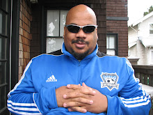
Man, I'm getting old.
Bo Jackson teaches youngling about who he is.
Bo on Bo
Thursday, April 2, 2015
Tuesday, March 24, 2015
Portland
So I'm watching the Warriors pre-game show before they take on the Trail Blazers and I notice a boys basketball game going on behind the announcers.
Then it hits me.
Portland is so white they couldn't find a black kid to play basketball.
Then it hits me.
Portland is so white they couldn't find a black kid to play basketball.
Wednesday, February 18, 2015
Fuck this shit
Chelsea, the eyes of the world are upon you.
Do the right damn thing. Strongly worded statements aren't enough.
Do the right damn thing. Strongly worded statements aren't enough.
Friday, December 5, 2014
Saturday, November 29, 2014
The Red and Blue of it
Today in our household we celebrate The Ga-e!
Neither I nor -y partner I went to either Ohio State or -ichigan, but as for-er residents of each state, this is as big a rivalry as they co-e.
If you spent any ti-e in either state, you know what I'- taking about. Even with a 25 letter alphabet.
Go Bucks!
Neither I nor -y partner I went to either Ohio State or -ichigan, but as for-er residents of each state, this is as big a rivalry as they co-e.
If you spent any ti-e in either state, you know what I'- taking about. Even with a 25 letter alphabet.
Go Bucks!
Sunday, November 16, 2014
Dear Bengals
Please keep playing like no one is watching you.
(Can they not televise playoff games?)
(Can they not televise playoff games?)
Thursday, September 18, 2014
You've done lost your damn minds.
Next time you redesign your league crest, don't let an student trying to make a name for themselves do it.
The blank "second half" make the whole thing look unfinished, and the slash past the perimeter looks like the crest's erect penis. It makes the eye look downward as opposed to your claim that the slash is rising upward.
I'm down with the idea of tailoring the colors to fit the teams, but you need something in that second half.
Next indeed.
Subscribe to:
Posts (Atom)

